Mada Masr is an independent news organisation in Cairo, Egypt. It was born when an entire team working for the Egypt Independent print newspaper were all laid off in a fairly politically-inspired move — they were too provocative for the bosses during a time when being provocative was a Very Bad Thing.
Starting out on their own gave them the freedom to say what they wanted to say, to be a progressive voice that held those in power to account. They published in English and in Arabic to reach as wide a local and international readership as possible. Their opinion pieces and long-form in-depth reports were hard-hitting and well written. They had cartoonists who lampooned those at the highest levels of government and military. Their news coverage touched areas that national papers were cautious to approach. They had a photo-story sister-website that worked with local and international photographers at a time when such people were commonly targeted by the regime. It was a risky business.
What they didn’t have was a decent website — their coworker who’d done a lot of work with Arabic web development and had created the first version had been arrested and imprisoned, and their online representation stagnated as a result. When at Egypt Independent, they’d had regular ‘artist interventions’, where they’d invite someone creative to create something unique to bind a print issue together. While I was researching their past work and identifying their collective personality, I observed that while they had this creative impulse, they didn’t have the flexibility to recreate it on the web.
The site had grown and evolved, but was stifling their output. It offered an unpleasant reading experience, especially on mobile screens, where it became virtually impossible to read. They published lots of news stories, but there was only one feed on their homepage, so their important long-form pieces were getting drowned out. The photo-story website had a completely different design and behaved like a separate entity, with no onward links to further reading about subjects being covered. Their homepage had web layout restrictions that led to headlines being cut off if words were too long — ‘brotherhood’ was a particularly important problem-word, given that the Muslim Brotherhood were taking most of the news in those days.
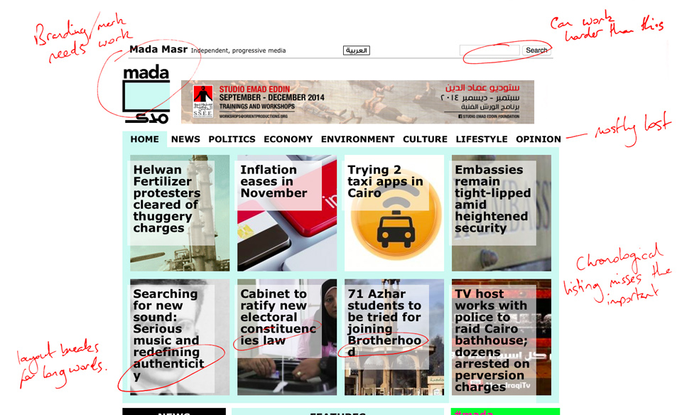
The most important problem though, and the one which led me to say that we couldn’t do a fix-the-problems redesign but had to start over, was that their personality wasn’t coming through. Whenever I approach branding work, I put it in terms of personality — if people are asked to talk about branding they tend to use words that describe and project but don’t emotionally resonate. When I considered the team and the work they produced, their passion and wide-ranging thoughts came through, their ability to take a long hard look and then pronounce a well-considered opinion. They were fascinating, a little wild, thought-provoking, a force of nature. They’re a ragtag bunch of committed professionals. The site needed to convey this personality.
One of their cartoonists, Andeel, was a major influence on the team. His cartoons were being used for income-generating merchandise and were regularly the most-shared pieces on the site. I came to a proposal that we use his cartoons to frame the site — I’d want to create a beautiful site that stood up against those of the major news sites like Quartz and the Guardian etc, but I also wanted to rough it up a bit — to make it clear this was an edgier proposition, that there were real people behind the headlines. Andeel-ification fitted the bill perfectly, and would pave the way for future artist interventions — I’d design the information architecture of the site and the presentation of content as cleanly as possible, but allow Andeel’s cartoons to set the tone and convey the personality. Future iterations of the site could simply swap out one set of illustrations for another.
I asked for readership and sharing counts for their recent output, but the team were busy doing their actual jobs, so I took it upon myself to do the research. I needed to know the volume and importance of the various strands of their work. I downloaded the last 100 articles published, manually tagged them with type and how they’d been classified for presentation. A limitation of the old interface was that an article could be in only one section at a time, regardless of content — there were also tags being used, but there was no hierarchy of meaning and the resultant tag pages were there only as an afterthought.
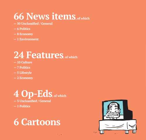
News items were clearly swamping out everything else. The homepage and section pages had a similar ‘gallery’ layout, so I had a look at how things got broken down there:
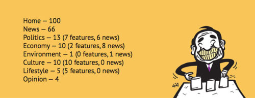
Nearly all the news items could have been classified as Political, and only the Economy section had more news than feature pieces. Like the homepage, each section page gallery presented 8 items at a time, so the Environment page looked like it would be completely refreshed every 24 weeks or so. The information hierarchy was letting the site down: places with lots of content would be overwhelmed by news; places without much regularly updated content were given the same prominence in the navigation as their most-read most-shared pieces.
I started to wonder if News needed a much less-prominent position in the site, but when I looked at the sharing figures across Facebook and Twitter (using Feedly’s share counts via Mada’s RSS feed), although their long-form and artistic work were regularly pulling in the numbers, there was an occasional news piece that was particularly widely shared — when Mada was first or they had a particularly good inside voice, for example when a journalist friend was arrested for daring to speak Arabic in a local cafe and Mada broke the story.
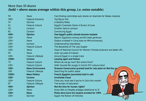
It was apparent that News was the bread and butter of Mada’s output — by volume it made up the majority of their content, and through that breadth it brought many first-time visitors to the site. What I proposed was that by implementing a more thorough tagging system, and separating the presentation of News and Long-form pieces, we could make the most of both — for every Feature or Photo story on a subject, there would be recent news articles to present; for a current news item we’d be able to show deeper analysis of the surrounding issue. The homepage could be divided to show News separately — give it its prominence, but not let it overwhelm the rest. Section and tag pages would have the same hierarchy, showing News if it was there, and collapsing down to show only Features if it wasn’t.
I proposed that we could demote the relevance of the structured sections — Economy, Environment, etc, and instead curate an ever-changing navigation bar — elevating currently relevant tags to the status of site navigation was both helpful to readers, and made a statement: These stories are what Mada’s about this week. The sections would still be accessible via a dropdown, but the personality of Mada meant that the site’s navigation should be current and arresting.
The final major proposition for the homepage was one borrowed from print newspaper industry — if there’s a huge story of the moment, we could feature it prominently as a paper’s front page would do. It could be a feature or a news story — whatever Mada was pushing heavily as their most important piece. I proposed a layout template that would let them take over a full browser viewport on especially important days, or collapse down to a hero image on normal days.

The footer of the site used an image representing Cairo’s sprawling housing development projects — the news was born of this place. During the design process I realised that the content should remain sacred, stark and unadorned; Andeel’s cartoons would illustrate Mada’s personality only in the framing of that content. Designing the article pages was then a relatively easy proposition — champion the reading experience above all else with great typography and an emphasis on appropriate line-length for the various screen-sizes. The only tricky bit of designing the whole thing in English and Arabic was that I didn’t read the latter. I did a crash course of learning about Arabic typography, sought advice from some of the leading Arabic type designers (via Twitter), and made some bold decisions about presentation that I’ve not seen on other Arabic news sites.
All tag pages, and section pages, and the homepage, and search results, and author pages — all of them could follow the same template. The only thing that separated section pages from the others was that they’d have an artistic treatment to frame the content — so we made a template structure that could allow them to promote any one of these lists of articles into something worth featuring. If they ran a series of articles on a theme, we could now give them a home that would be enticing to view and share.
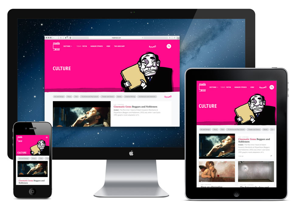
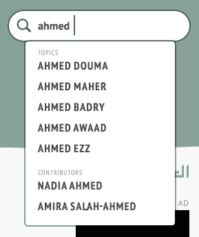
The search function of the site would be greatly enhanced by this new tagging structure — you could still search freeform text, but we’d use a dropdown to direct people to topic pages as defined by the tags or authors:
I designed everything to a grid system, so rearranging the content blocks to suit various screen sizes was achieved with an initial layout guide and then an interactive process during development. It worked beautifully.
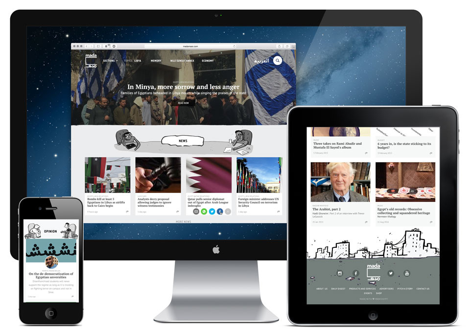
The photo-story sister site was integrated into the main site — harmonising the styles and cross-pollinating with related content. Sharing interactions were available on every article from any page, taking note that WhatsApp was of major relevance to their Egyptian readership, so on smaller screens the share button would present that as an option.
I was off doing projects in India and Myanmar during most of the development process, so I worked with Cairo-based development team eSeed at a distance, sending about a million emails with thousands of screenshots and pixel-tweaking adjustments, arguing hard and compromising where necessary in order to arrive at a successful launch.
About 6 months later, the Egyptian government banned the site so it’s now only accessible from outside the country.
