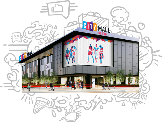
City Mart Holdings Ltd own a number of supermarket chains, restaurants, malls, convenience stores, pharmacies, book stores and more. They do have competitors, but they’re Myanmar’s largest retail chain by some margin. Nexlabs had successfully done the branding for their first shopping mall, so we had a good relationship with them, but this would be the first taste we’d get of working on their digital products.
They approached us to design the brand and interface for a new customer loyalty app. They’d already made an implementation partnership with a Bangkok-based service provider of, curiously, branded mobile wallet apps, so all we needed to do was make sure it would appropriately serve their business needs and the needs of their customers.
The Right Approach?
The Bangkok-based partner T2P was providing a white-label app on which consumers could store digital payment giftcards, and they’d launched a few in Thailand. I love taking apart products, investigating how they’re hitting or missing intended targets — but this one was tricky.
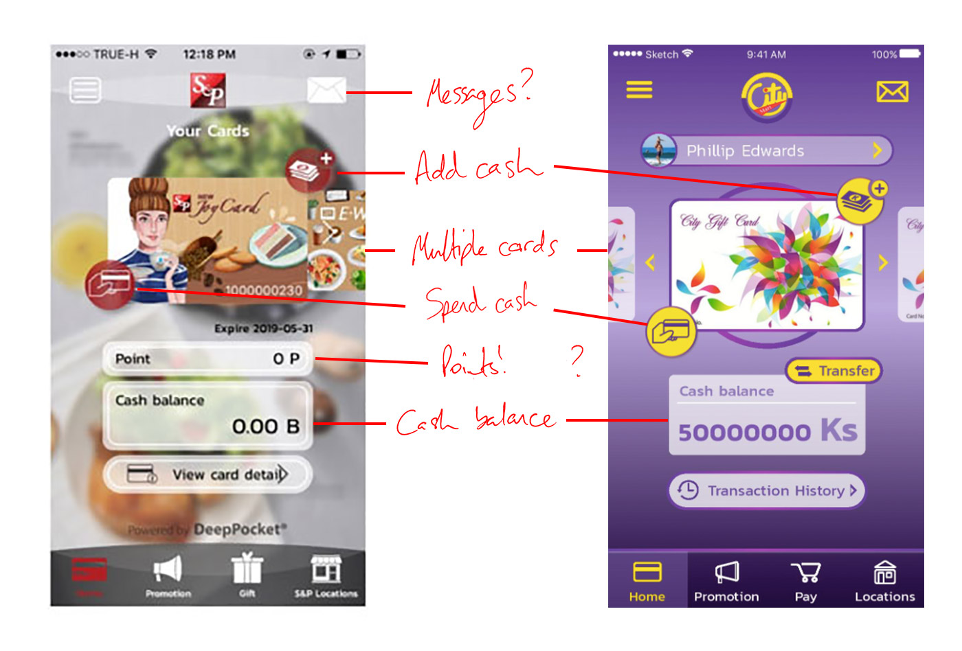
The project lead at City Mart had told us the primary feature of the service had to be loyalty, with the typical accruing of points, easy spending, redeeming and targeted discounts. They’d asked us to take a pass at the UI, but I was stumped — the app proposal seemed far more a digital wallet for multiple cards than anything to do with loyalty.
This seemed to make multiple cards the focus of the app, with the enticing carousel as a nice but inappropriate UI for flipping through them. Each looked to have its own cash balance, and the main actions were to add or spend money. Given the level of unbanked population in Myanmar, the only way I could see customers putting money into their account would be to visit the shop, add cash at a service counter, then spend it at the till.
¯\_(ツ)_/¯
We put our thoughts into a presentation, with a tear-down of problem areas and possible solutions as they’d requested, but additionally a strong emphasis on identifying the key goals of the loyalty scheme, lessons gleaned from other markets, and a starter proposal for an improved overall approach.
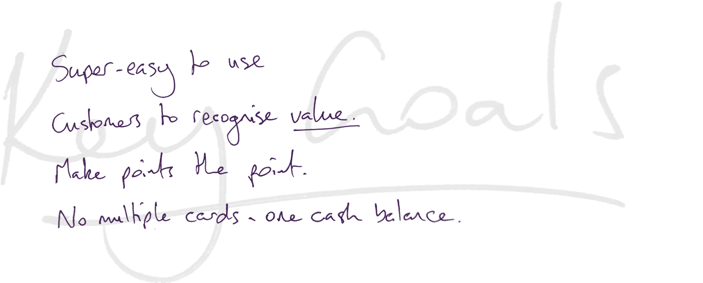
Fortunately, the CMHL team agreed with the key goals we’d identified, so we were given a green light to put together an alternate approach. The T2P team members looked a bit dubious but looked forward to seeing what we came up with.
OK, so a new plan
Our new proposal was based on a fundamental point: the user experience of the transaction happens in real life, not in the app itself. Just open it and present to the cashier, zero taps. The core of this experience is the cashier asking “Do you have City Rewards?”, which would prompt people to remember and use it, or to sign up as a new member.
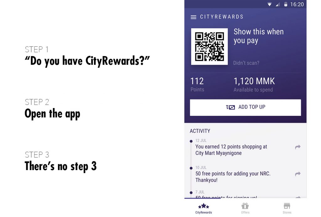
We proposed
- A zero-tap core interaction
- Rather than digitally representing multiple giftcards, they could be rolled into one simple cash balance.
- That cash balance would also reflect the convertible value of the customer’s collected points — revealing the value of collecting them in the first place.
- The QR code would simply be a static user-identifier so it could be used offline, which would solve the inevitable issue of Myanmar’s sketchy phone coverage.
- Any spending of cash balance would require authentication through fingerprint or PIN, depending on the phone’s capabilities.
- There was a strange gift feature in the S&P Bakery app, where people could send a discount voucher to a friend for an individual item, e.g. 30B off a Doraemon Cake, but CMHL’s available products numbered into the high thousands and would require a whole shopping interface to support it.
- The Myanmar government says that services like these must gather personal identity docs, which is obvs a barrier to user adoption. In order to smooth the registration flow we proposed a progressive on-boarding where after an initial easy signup, customers would be encouraged to add further personal info in return for free points to help them get started.
- This speedy initial accrual of points would get people off to a good start, and we’d encourage further sharing of the app with referral points.
Because we’re a nice polite agency, we also included a visual pass of the T2P app, despite again making clear the problems and missed opportunities we saw. Sometimes it’s good to show that you can do what a client has asked alongside the improvements you could make.
The presentation went well. There was a wonderful moment towards the end where we put the stark choices in one slide and asked for decisions. The CMHL project lead saw some humour in this, but was convinced — we could go ahead and flesh out the rest of our proposed app. The ease and directness of the customer’s core interaction would be the priority.
I love walking out of meetings like that.
However,
So we did what we could.
The UI stands up against other leading apps in the country, so I really shouldn’t be sad. There’s a really nice unique-to-Myanmar NRC-input form that Ko Chan designed in there, the registration flow is quite sweet, and the branding team did a really nice job.
I just … it should have been better.
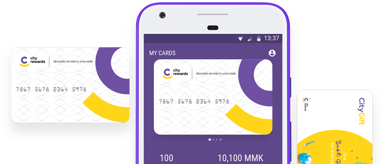
The app has been downloaded from Google Play Store 100,000+ times and has a 4.3⭐️ rating.
